 |

Set Review: 21332 The Globe
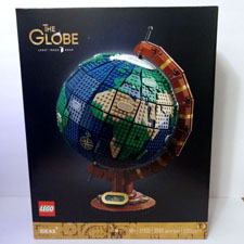
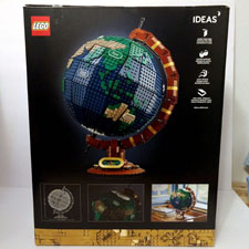
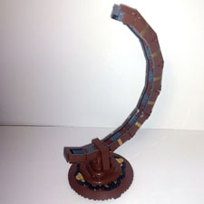
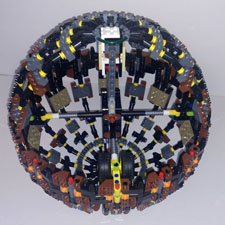
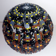
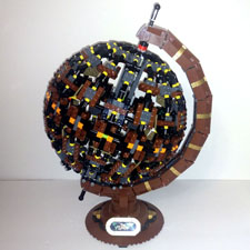
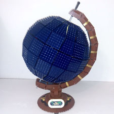
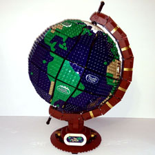
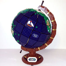
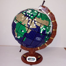
Today, BZPower Reporter Xccj is going to review the planet as he takes a closer look at 21332 The Globe. Is this worth the world or are you better just getting a folded map? Read on for a somewhat differently structure review, or jump over to Instagram to get all the pictures and less of the words! Instead of doing a standard review, I'll instead break this into a stream of consciousness based on thoughts I wrote down while building. Following a look at the internal structures, we'll then take a tour of the world to visit all the locations depicted on the surface, so make sure to bring your jacket. And for reference, 21332 The Globe retails for $199.99 USD and includes a whopping 2585 pieces. (I know there were inevitable some changes from the original Ideas submission to this design, but since I didn't study the former in great detail, I'll stick to just describing the latter.) Bag 1
Bag 2
Bag 3
Bag 4
Bag 5 / 6
Bag 7
Bags 8 – 11
Bags 12 - 15
Bag 16
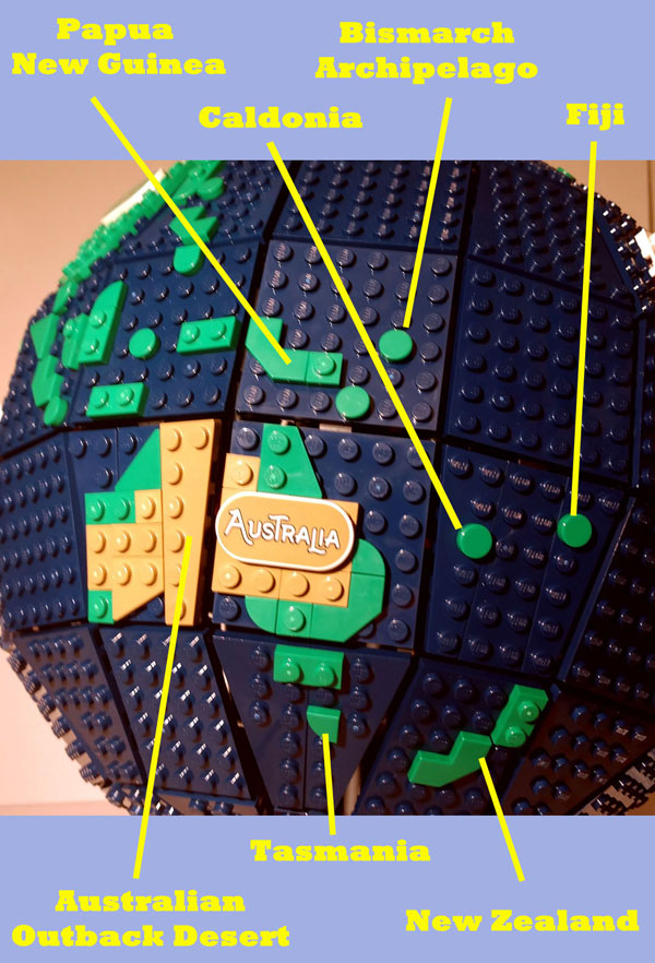
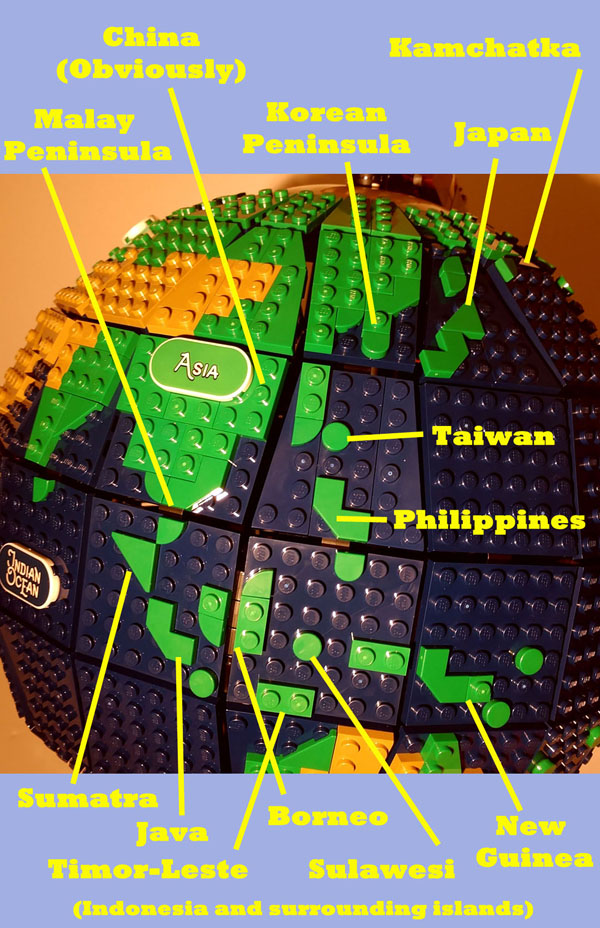
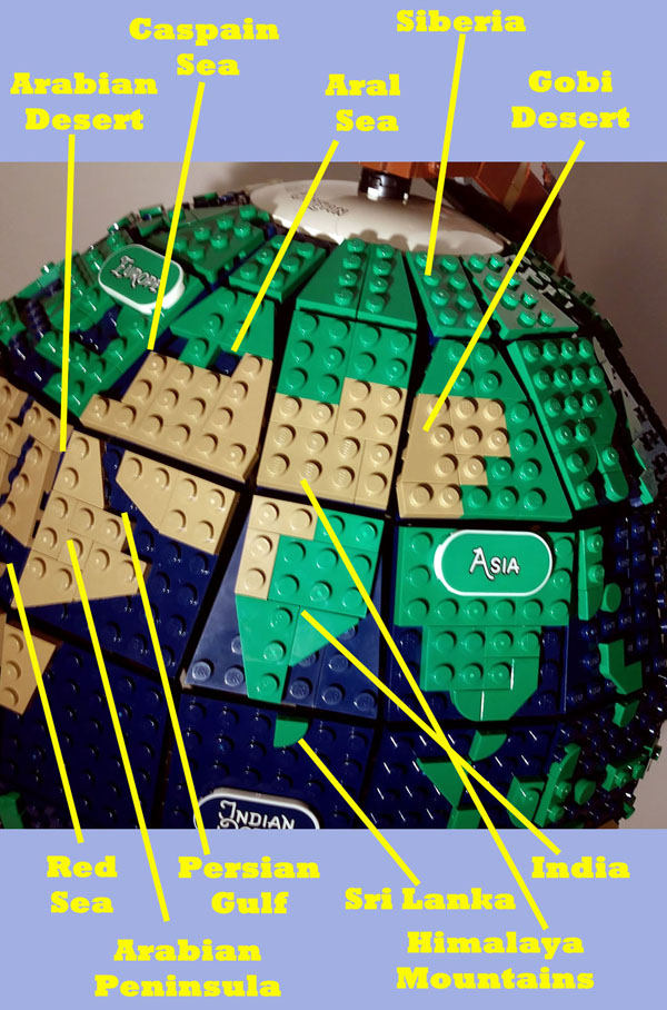
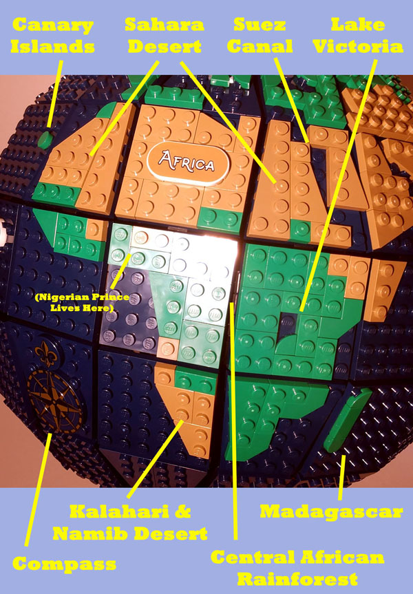
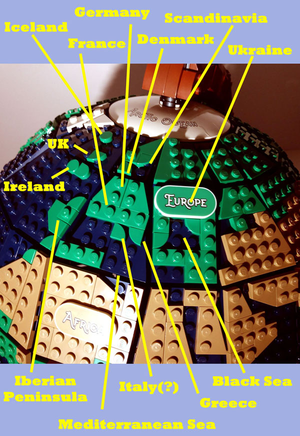
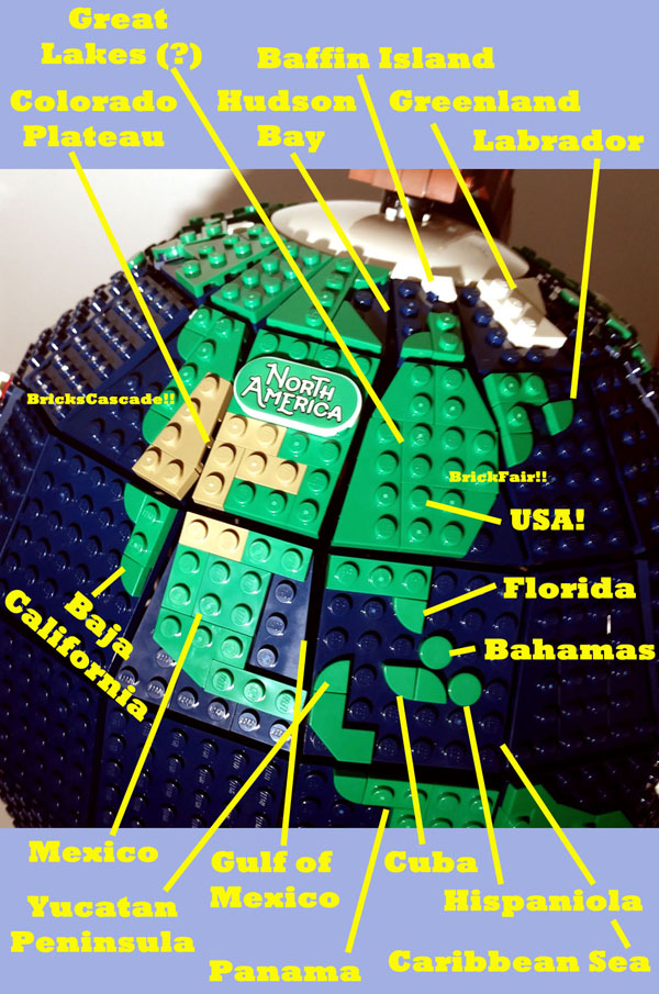
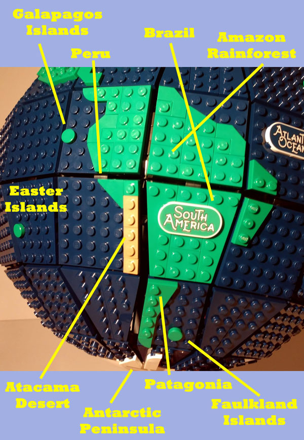
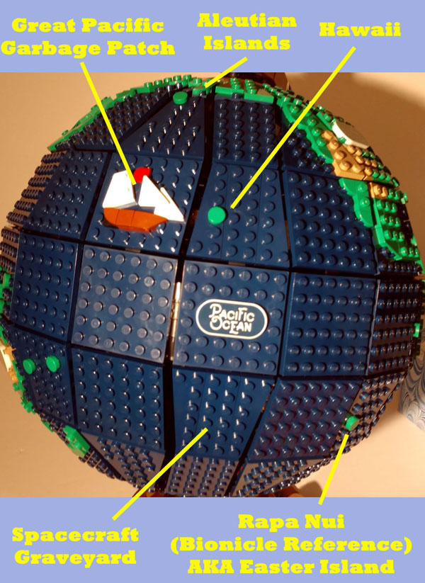
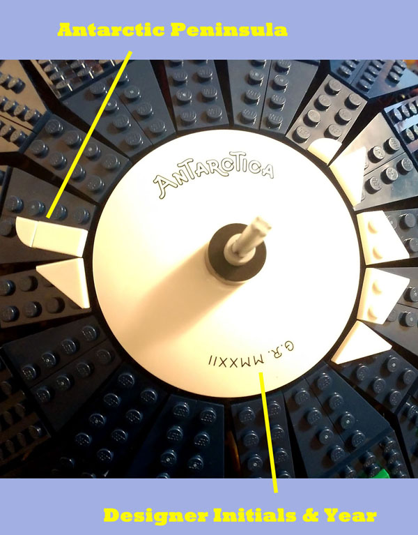
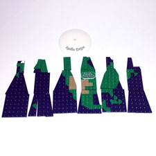
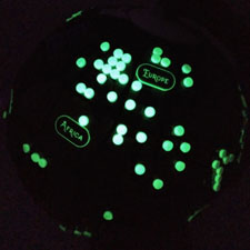
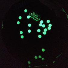
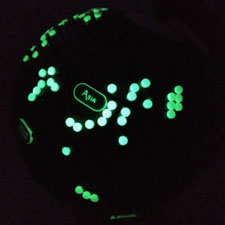
And now that the whole thing's built, let's take a tour of the world, identify the land areas, and critique the shaping! I think Australia gets a good treatment here. The shape is very apparent, and the Outback Desert is in the center with the more tropical regions in green along the coasts, and Tasmania to the southeast. Australia also gets the name plaque, so Oceania and the other islands don't get fully recognized. To the north, you have a decent depiction of Papua New Guinea. The dot to the side of it is either the Bismarck Archipelago or the Solomon Islands. The dots further to the west of Australia are probably New Caldonia and Fiji. There are a bunch of small island nations in that area (Vanuatu, Tonga, Samoa, and more) but they are likely too small to get represented. And, of course, New Zealand is to the southeast, representing all of Middle Earth. Indonesia and the surrounding islands got the short end of the stick in details, as the region looks awful. This in part is because there are so many islands here, and they're trying to represent them with water gaps between them, making the land seem a lot more spaced out than it really is. The island of New Guinea (half of which is Papua New Guinea, mentioned earlier) starts off in the east. Directly to the west of that is probably Timor-Leste, but there are a lot of other small islands in that area too. Continuing west you have the island of Java, represented by the angled plate, and that goes up into the island of Sumatra, represented by the triangle plate. East of that is the bigger island of Borneo, and the dot to the east of that is likely Sulawesi. If you turn north, you have a few tiles that represent Philippines, and then Taiwan north of that. Looking at mainland Asia, one of the weakest designs is the Malay Peninsula, which loses all details into a single quarter circle tile. (Singapore is in there somewhere.) It bulks up a bit as you get into Thailand and Myanmar, and then you start following up the Chinese coast. The Korean peninsula is quite apparent, as are the Japanese islands. (The minifig globe LEGO released last year neglected Japan in the first design, but then they redid it and added the islands back in. No such trouble here.) And although it didn't quite make it into the photo, the Russian Kamchatka Peninsula is detailed out too. Asia is the largest continent, and it one of the few places where entire sections are covered in land plates. In the center you have the shapely Indian subcontinent with Sri Lanka off to the southeast. Moving east, you see the Arabian Peninsula, which has a detailed coastline with the Persian Gulf to the northeast and the Red Sea to the southwest. Most of the Middle East is colored in dark tan, which stretches from the Arabian Desert to the Himalaya Mountains and the Gobi Desert in China. It's a bit unfair to count all of that as desert, since there's a lot of other more temperate biomes mixed in there. I always had the perception that the Middle East and Asia was a dry wasteland, and such coloring helps drive that misconception. Still, it's not easy to add such intricate details at this scale, so we just have to accept that the deserts and mountains make up the majority of the region. To the north of the desert, you see representations of two of Asia's inland seas, the Caspian Sea and Aral Sea. The Caspian Sea is technically the world's largest lake, but it's poorly represented here as the gaps between the tiled section, which seems like a bit of a disservice. Squeezing in a tan wedge instead of a full plate could've make it more apparent. Meanwhile, the single stud for the Aral Sea is perhaps too generous, because the lake is a shadow of its former self given that water runoff is being diverted away. Seriously, check out a satellite view of the region and the few remnant lakes give a brief outline of how large it used to be. Lots of map projections tend to shrink down Africa to give us a more Eurocentric view of the world (in that Europe is big and important and Africa is perhaps the size of Greenland. The Mercader projection is the worst.) Here Africa is suitably large and the shape is instantly recognizable. The Sahara Desert takes up a majority of the northern section of the continent. . . and as far as I can tell, this isn't an exaggeration, because the Sahara is just big. Central Africa hosts some rainforests and stays green, which the southwest portion features the Kalahari and Namib Deserts. (Although they don't reach all the way down to Cape Town at the southern end.) Lake Victoria is also featured in the east. Ironically, the Great African Rift is not aligned with one of the sectional divides, which is a shame because it's the one place where plate tectonics are spreading apart that's above water. You also get the long island of Madagascar to the southeast (full of lemurs, of course.) The dot to the northwest is the Canary Islands, which includes the La Palma volcano that was in the news last year. (Which has the potential to trigger a tsunami to swamp western Europe and the US East Coast.) All in all, a lot of Africa is fairly accurate in size and shape here. Still, there are fewer regions that are called out here compared to the other continents; part of it is likely because I'm less familiar with Africa's geography. You don't have representations of the various major rivers like the Nile or Congo, nor are a lot of countries very visible. (To be fair, most country borders were drawn by Europeans centuries ago and didn't take into count the cultural divides.) I feel like I should have more to say about this, but I'll just settle that it seems to be a good depiction of the continent. (So let's go bless the rains there.) In the southern Atlantic Ocean you also have a cool compass design, which is part of the appeal of the globe. The tiles are wonderfully printed here. I've seen a lot of people complain about the shaping of Europe. Part of the problem is that Europe has a lot of little details in it that don't translate well into this scale; the other problem is that Europe's shape is far more recognizable to most consumers of the West. (Who are otherwise Geography-illiterate, probably.) Some parts are adequate in my opinion; the Iberian Peninsula with Spain and Portugal is clearly there, and the shape of Scandinavia in the north seems reasonable. I also like the inclusion of the Black Sea and the curved tile that represents the Greek Islands, and the Mediterranean Sea's shape remains consistent. (The Europe tile ends up covering Ukraine, which is a bit odd since that's generally regarded as the eastern edge of Europe and the tile makes it feel more central. Alas, Europe just doesn't have room for it elsewhere.) There are two problem points. The first is Italy, who's boot is only represented by a quarter circle tile. A little more effort could've been made to make its shape more recognizable. (I've seen the suggestion of using the angled tile used in Iberia to form the boot.) The other is the British Isles, which include Britain and Ireland. (I think I'm identifying these right, I know there are a lot of specifics for those names.) The islands are located too far to the west; they're supposed to be place just north of France, but that area ends up being a gap between panels, so they're pushed two studs west. And it just throws off Europe's shape. I'd also say the three tiles make the islands too large; it should be represented by a single tile and moved as far east as possible. I know the UKers probably just wanted to make sure their island was easily visible, but it's just in the wrong place entirely! (Ironically, the dot north of them is supposed to be Iceland, and its location relative to Spain seems fairly accurate.) North America is fairly recognizable, but some of the details are smoothed over here. I think one missing detail is the lack of any Great Lakes; they are arguably larger than the Aral Sea, so a single stud to represent them would've been nice. (Granted, that placement would put them close to the gap between sections, so maybe it was too hard to find room for them so they were just neglected instead.) Otherwise, the US is modestly well done, with the apparent Florida peninsula and the Colorado Plateau desert region in the southwest. In fact, the section gap actually helps make the Baja California peninsula very accurate, so that's a plus. In the Canadian north you have the Hudson Bay's shape, but you lose most of the artic islands beneath the ice sheet dish. One white tile represents a snow covered Baffin Island, I think, and then more white tiles to the east represent Greenland. The island of Labrador is also shown off the coast of Newfoundland. On the other side, you have some nice details of Alaska, although they're on the edge in this photo. (The Aleutian islands are represented anyway, but they essentially reach over into Asia here.) Moving towards Central America, you have Mexico narrowing out into the other various countries and down to Panama that connects to South America. (If you'd like, you can say the gap between sections represents the Panama Canal, although the placement isn't perfect.) The best detail is the quarter tile representing the Yucatan Peninsula. Off the coast you have the long island of Cuba, the island of Hispaniola east of that, and what I assume are the Bahamas north of that. The rest of the Caribbean islands doesn't get a feature because they're just too small. Still, I think at least one more would've done a good job at representing how the Caribbean is a bit separated from the Atlantic Ocean. The final main continent is South America, which has some good shaping in the north around the coastlines of Brazil. It would've been cool if the section gap aligned with the Amazon River, but alas you just got to enjoy the green of the Amazon Rainforest, although the Atacama Desert is represented in the west. I am a bit disappointed in the southern section of Patagonia, which seems far too narrow; I would've widened it out by another stud. (The gap between sections does get in the way there, so I'm guessing that's why it was thinned out.) You get a couple of islands features around here. In the North West, you have the famous Galapagos, and in the south you have the Falkland Islands. Finally, off to the far west, a full ocean panel away from the continent, you have Easter Island aka Rapa Nui. This is clearly a Bionicle reference. The Pacific Ocean is the world's largest ocean, taking up 30% of the planet's surface, so a lot of empty blue plates are used to represent it. A few details have been used to make it less of a blank slate. A small sail boat design is floating left of the green dot that represents Hawaii. This, I believe, must be a representation of the Great Pacific Garbage Patch, a giant trash island that's floating around in the Pacific. Antarctica isn't fully visible when the globe is on the stand, but if you take it off you can get a closer look at it. It's all white to represent the ice, and a few plates are used to widen out the coast, including the Antarctic Peninsula reaching up towards South America. You also have the designer's initials and the year of release printed down here; this is not a geographic feature but rather a design element of the globe. Of course, if a spherical globe goes against you're mindset, I'd like to start off by telling you you're completely wrong. But all the same, here is what the map would've looked like on a flat surface. (Well, North America anyway, I wasn't going to take apart the full globe to test this out.) Lots of unexplained gaps in there, right flat-Earthers? If you fill in all those gaps at the top with land, then congratulations you have the Mercader Projection. One of the more unusual features is the continent plaques all glow in the dark, so presumably you can see places like Europe and Africa in the dark. This seems like a useless feature, since you lose any of the other detailing in the dark and just looks like there are floating nametags. However, this is perhaps more of a missed opportunity. The previous World Map features different colors to represent ocean depths; so why not include some more glow in the dark pieces to represent light pollution! Some of the continents give off a lot more light at night than others, and in some ways it's a handy guide to population distribution. After studying a light pollution map, I added 100 glow in the dark round 1x1 tiles myself to give the globe a more accurate representation in the dark. Final Thoughts
This is very much a build aimed for adults. The process is monotonous at times, and the finer land detailing would perhaps be lost on young and impatient children. Not to mention that it's somewhat fragile while building, so patience is needed to make sure it doesn't fall apart until it's all together. (At which point it becomes somewhat sturdier as a full sphere.) The price is high enough that you should know if you want this set well before buying it; no impulse purchases here. If you like globes and geography and the classic looks, then this will be appealing. Although there are plenty of errors in the landscapes, many of them were obviously done for design reasons and there's enough accurate details to make up for them. Granted, I still need to find a place to display this; it will take up a bit of room once fully built. Thanks for reading my long-winded review. Make sure to check out Instagram and the BZP front page for more set reviews in the future. 
|
